Archives

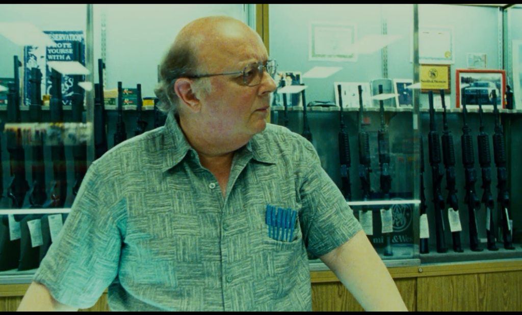
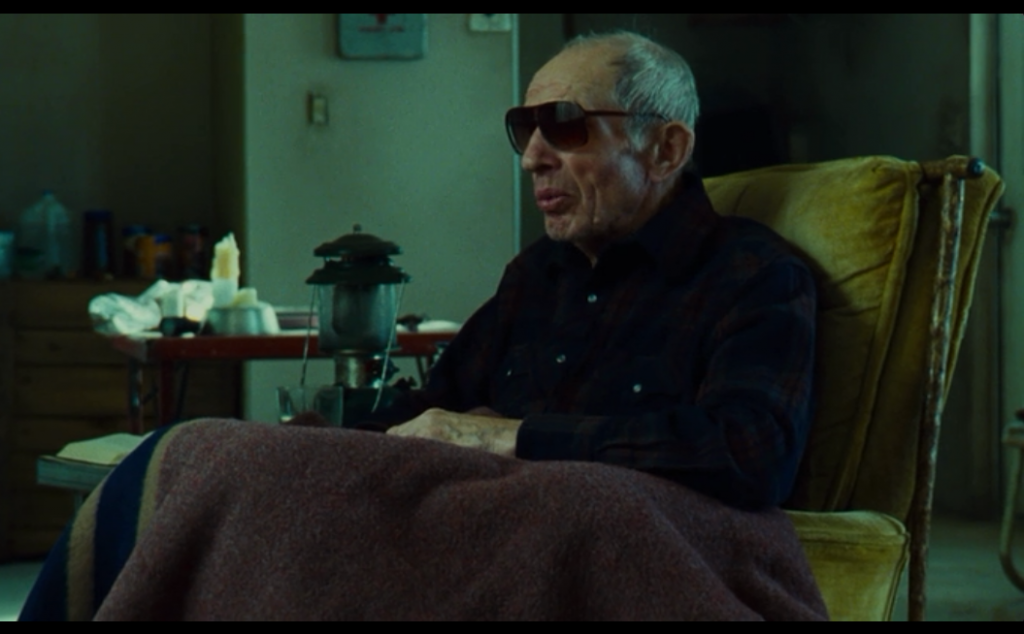
This Must Be The Place – cross processed

Cross processed slide film when balanced to appealing skin tones can send the rest of the picture to a strong vibrant green. In this case it’s used as a gritty fluorescent effect. This could also be described as an aquamarine wash with skin-tone recovery selections.

Both of these scenes have a sort of gross institutional feel, the kind of place you wouldn’t want to spend a lot of time, which says something about the motivations of the characters found there.

This Must Be The Place  -  digital intermediate colorist Andrea Orsini  35 mm (Kodak Vision3 200T 5213, Vision3 500T 5219) negative to 2K digital intermediate

This Must Be The Place – digital intermediate colorist Andrea Orsini
35 mm (Kodak Vision3 200T 5213, Vision3 500T 5219) negative to 2K digital intermediate

ThisMustBeThePlace 011

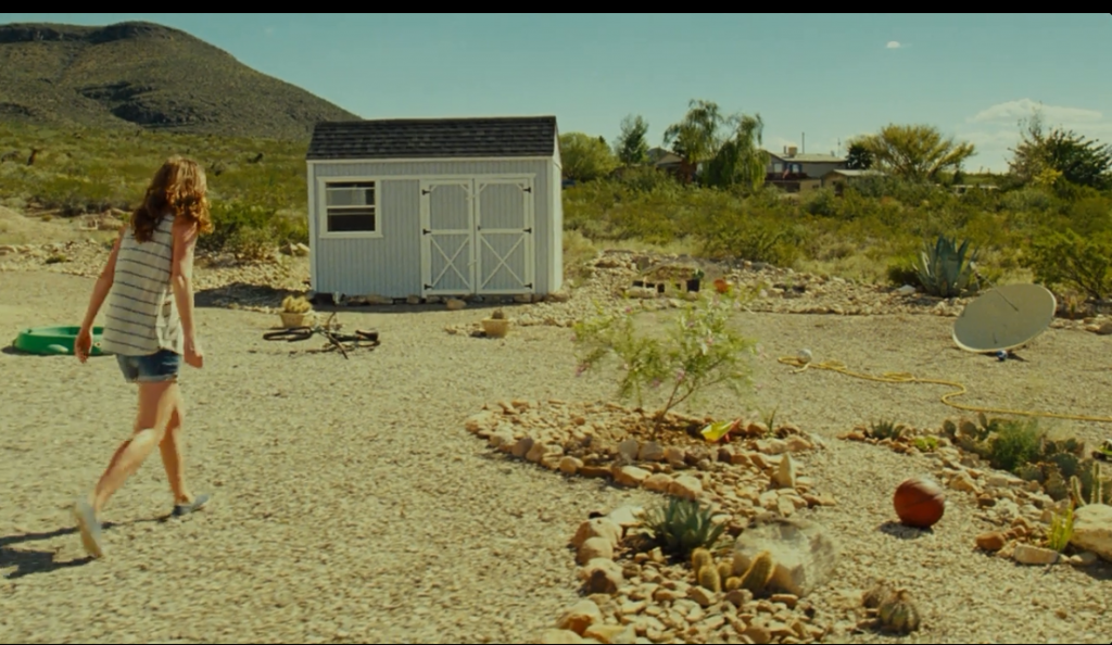
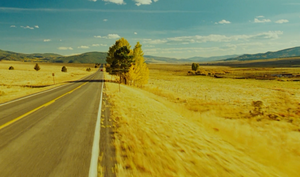
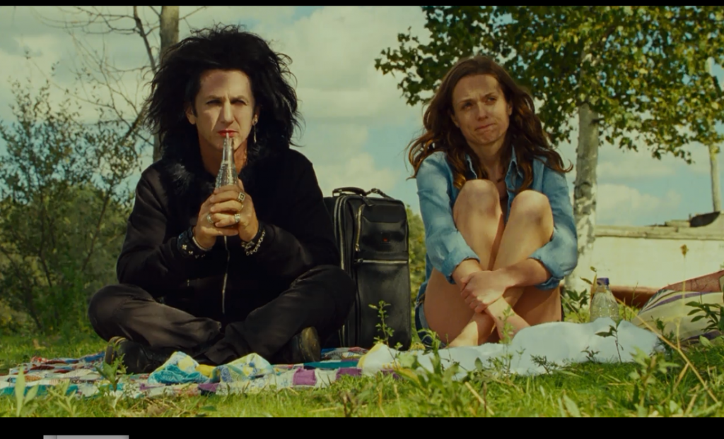
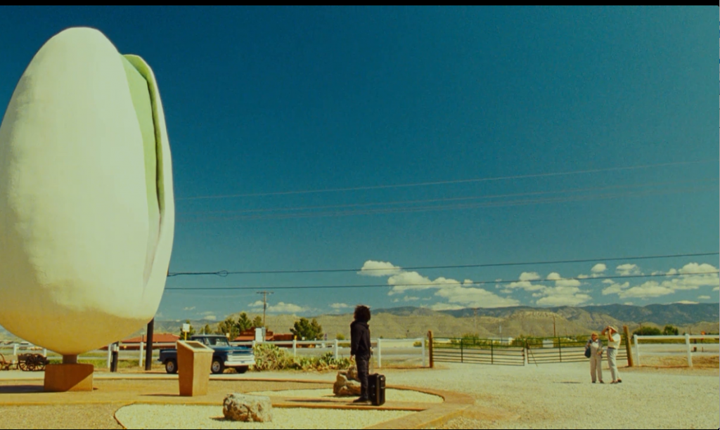
This Must Be The Place – golden sunny

A hot gold wash sells this middle-American summer, balanced by a selection to maintain the rich cyan sky. Amber waves of grain show the classic beauty of an American road trip to a long time shut-in finally returning to the world.

This Must Be The Place  -  digital intermediate colorist Andrea Orsini  35 mm (Kodak Vision3 200T 5213, Vision3 500T 5219) negative to 2K digital intermediate

A strong gold wash is balanced out by a rich cyan sky selection.

This Must Be The Place  -  digital intermediate colorist Andrea Orsini  35 mm (Kodak Vision3 200T 5213, Vision3 500T 5219) negative to 2K digital intermediate

This Must Be The Place – digital intermediate colorist Andrea Orsini
35 mm (Kodak Vision3 200T 5213, Vision3 500T 5219) negative to 2K digital intermediate

ThisMustBeThePlace 003 ThisMustBeThePlace 005

Drinking Buddies – low con high sat orange/teal

Drinking buddies is a rare color specimen. Properties normally associated with high budget block busters are applied to this low budget indie flick. As seen here, the orange/teal split is used, but on a low contrast image with saturation often leaning to the high side.
Perhaps this look mimics the production, using fairly big main stream names for a less than million dollar film and indie-standard story.

Drinking Buddies (2013)  -  Colorist Alex Bickel Red Scarlet  2.35 : 1

Drinking Buddies (2013) – Colorist Alex Bickel
Red Scarlet 2.35 : 1

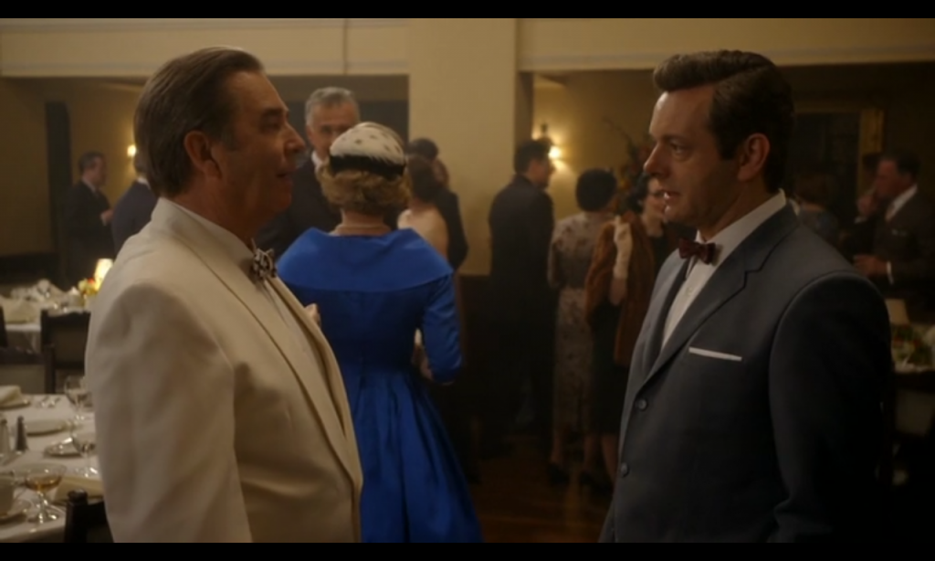
Masters Of Sex – warm with neutral punch outs

This scene is very warm, but high saturation apparel remain unaffected by the warm grade. Because of their more neutral balance and high saturation these items stand out quite a lot. It’s slightly distracting to me because they don’t quite fit in, but perhaps it indicates a rising popularity of saturated synthetic fabrics, which at the time were breaking new ground on a regular basis. According to http://www.straw.com/sig/dyehist.html in 1956 “One person working out of every 7 in the USA received his income from work performed in textile or apparel industries”

The interesting thing about this scene is that the colors that stand out are not worn by the main characters, they are not to draw attention to the dialogue but perhaps to draw it away. Most of this scene is posturing, the intermingling of people, winding down previous events and a calm before the storm to come. The dialogue itself is fairly benign.

Masters Of Sex - colorist Randy Starnes

Masters Of Sex – colorist Randy Starnes

Moneyball – retro look

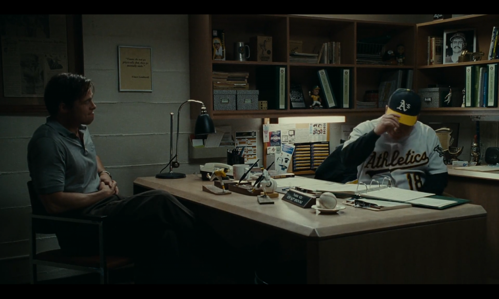
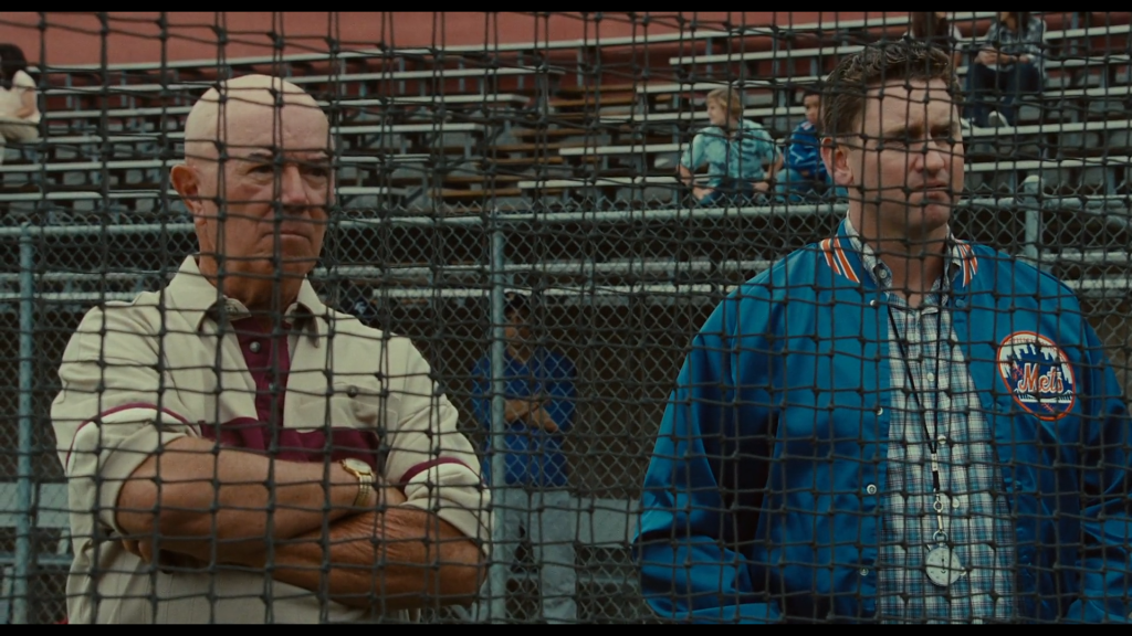
Moneyball has a fairly nostalgic look, not one harkening to the time it takes place -the mid 90s- but perhaps the 60s, a time I identify in film by the hue of their greens and blues, fairly dark mid tones, cream highlights, and lowish saturation levels.

This look reminds me of the men in the story who sit at the table as advisers to the Oakland A’s general manager Billy Beane (Brad Pitt). Men who grew up as baseball’s professional format cemented and were part of a generation in awe of Babe Ruth -always looking for that monolithic star communities gather around.

This film takes place in their world. It might be the 90s, but their formative years were in the 60s. This look makes Billy (Brad) feel stuck in that time. And now the Goliaths of economic disparity and a calcifying industry formula have left him little hope for an equal fair shake on the field. He struggles amongst the old guard for a new idea to stay alive, and new direction to make his mark.
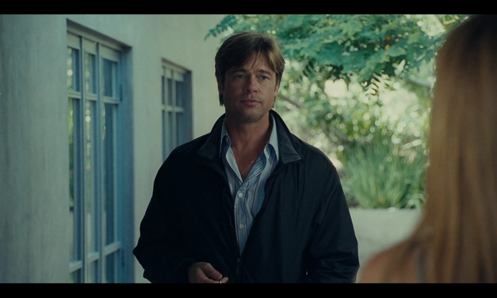
Money Ball  -  Steve Bowen digital intermediate colorist  35 mm Negative (Kodak Vision3 250D 5207, Vision3 500T 5219) to 4K digital intermediate, Kodak Vision 2383 prints
Money Ball – Steve Bowen digital intermediate colorist
35 mm Negative (Kodak Vision3 250D 5207, Vision3 500T 5219) to 4K digital intermediate, Kodak Vision 2383 prints
MoneyBall 015
MoneyBall 004 MoneyBall 006

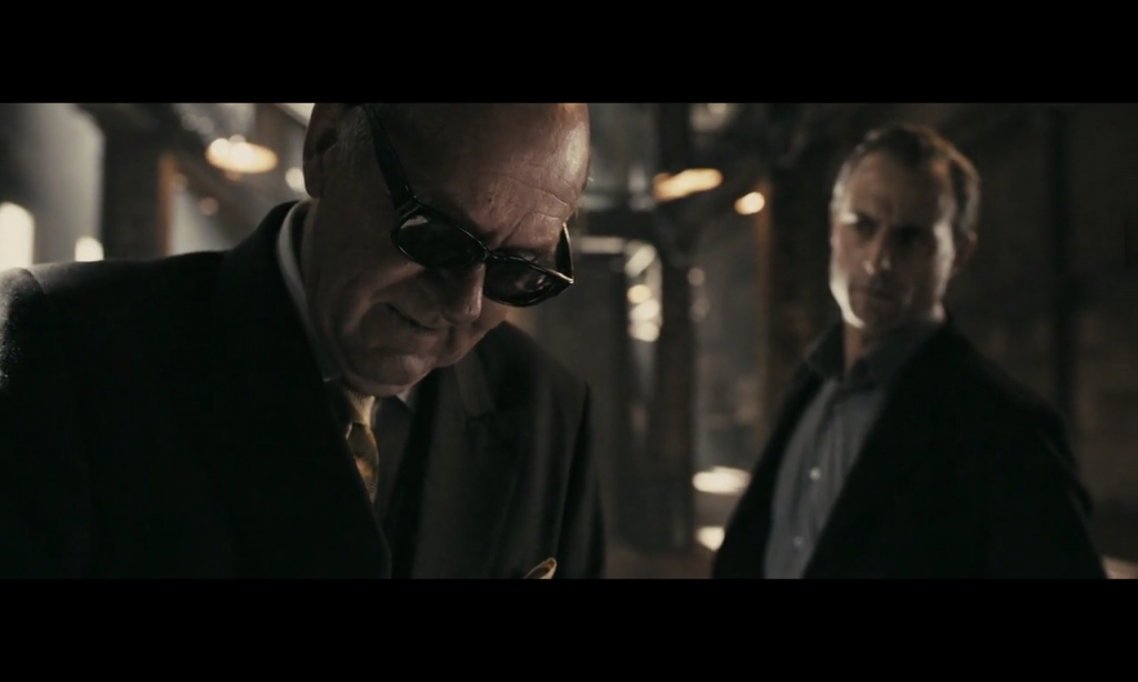
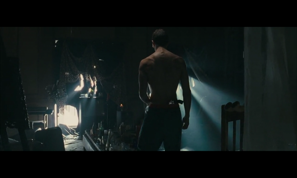
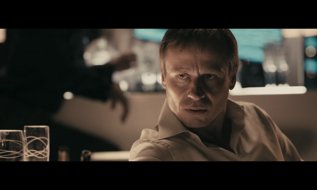
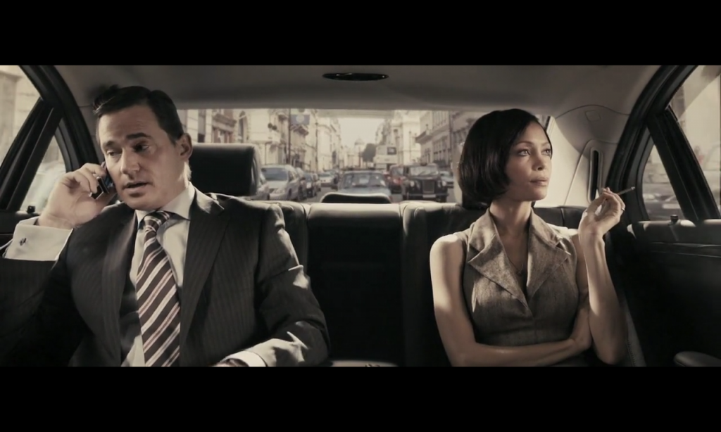
Rock N Rolla – three color palette

Rock N Rolla has a few different colors throughout but overall its extreme look has a limited color palette of three main colors: Cream, Sienna, Blue. Some scenes use only two of these hues, some use all three, but almost every shot contains the burnt sienna reds.

RockNrolla 011

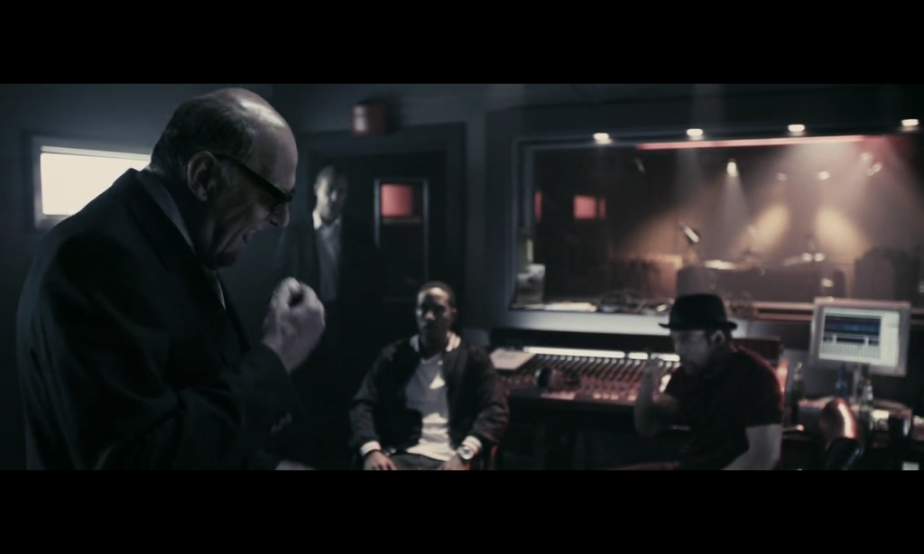
Blue/red split with cream highlights.
The mixing board, and everyone’s skin are roughly the same hue, with a sudden jump to blue shadows and cream highlights.


RockNrolla 009

Rock n Rolla - Rob Pizzey   digital intermediate colorist Arriflex D-20 HDV source, digital intermediate post, 35mm anamorphic Kodak and Fuji to print at 2.35 : 1

Rock n Rolla – Rob Pizzey digital intermediate colorist
Arriflex D-20 HDV source, digital intermediate post, 35mm anamorphic Kodak and Fuji to print at 2.35 : 1

RockNrolla 008

RockNrolla 005

Rock n Rolla – Rob Pizzey digital intermediate colorist
Arriflex D-20 HDV source, digital intermediate post, 35mm anamorphic Kodak and Fuji to print at 2.35 : 1

RockNrolla 012

Sienna/Cream split.


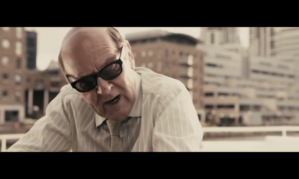
Prometheus – monochromatic (blue) wash

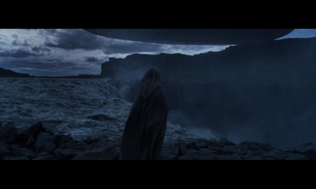
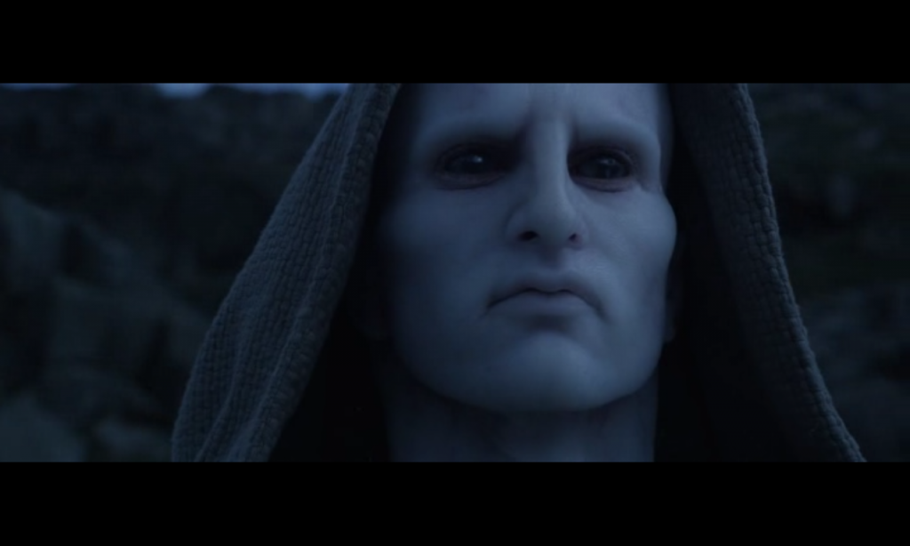
Prometheus begins with a pre-dawn blue light. This scene feels as calm as morning coffee before the hustle and bustle of a world springing to life. The morning look works as a sort of double entendre of figurative foreshadowing: present day in lush Scotland finding cave paintings like the scene before, as well as linking that past with the monochromatic alien world to come.

Other colors in this film are almost exclusively reserved for humans and human habitat. The sterility of monochromatism isolates the cerebral logic and monolithic power of the alien world from the nature and emotion of humanity.

Prometheus - Stephen Nakamura Digital Intermediate Colorist Red Epic Redcode RAW (5K) (dual-strip 3-D) source format

Prometheus – Stephen Nakamura Digital Intermediate Colorist
Red Epic Redcode RAW (5K) (dual-strip 3-D) source format

Prometheus - Stephen Nakamura Digital Intermediate Colorist Red Epic Redcode RAW (5K) (dual-strip 3-D) source format

Prometheus – Stephen Nakamura Digital Intermediate Colorist
Red Epic Redcode RAW (5K) (dual-strip 3-D) source format


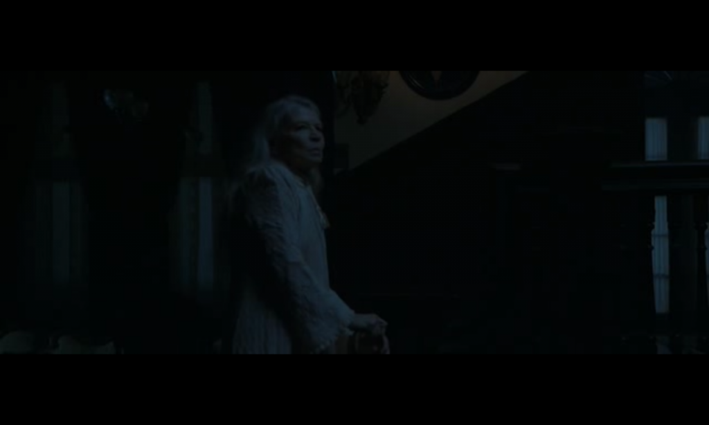
Benjamin Button – a very dark night

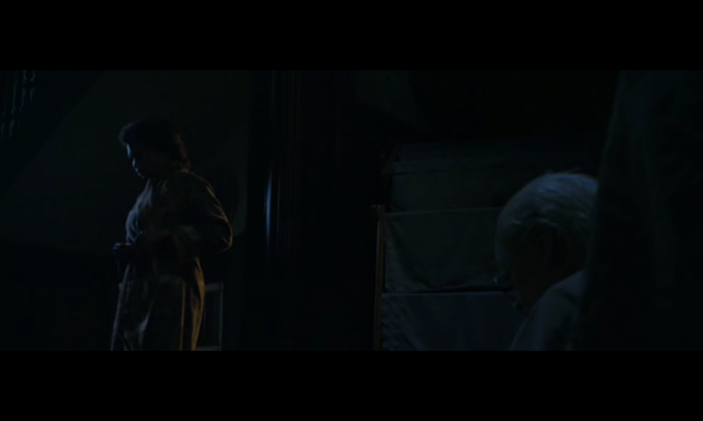
Slightly lifted blacks retain shadow detail and overall subtle visibility while the scene is told through the movement of a few small highlights. A bit of gold light spilling in from the other rooms keeps the scene dynamic and eludes to this being a space not normally occupied by nighttime activities.

The Curious Case of Benjamin Button (2008)  -  Senior D.I. Colorist Jan Yarbrough Arriflex 435, 35 mm (Kodak Vision2 50D 5201, Vision3 500T 5219) Sony CineAlta F23, Thomson VIPER FilmStream Camera; 4:4:4 1080p log

The Curious Case of Benjamin Button (2008) – Senior D.I. Colorist Jan Yarbrough
Arriflex 435, 35 mm (Kodak Vision2 50D 5201, Vision3 500T 5219)
Sony CineAlta F23, Thomson VIPER FilmStream Camera; 4:4:4 1080p log

With highlights riding around 20IRE and bottom blacks for green and blue around 4IRE, this must have been shot somewhat brighter to avoid noise and lowered to these levels.

The Curious Case of Benjamin Button (2008)  -  Senior D.I. Colorist Jan Yarbrough Arriflex 435, 35 mm (Kodak Vision2 50D 5201, Vision3 500T 5219) Sony CineAlta F23, Thomson VIPER FilmStream Camera; 4:4:4 1080p log

The Curious Case of Benjamin Button (2008) – Senior D.I. Colorist Jan Yarbrough
Arriflex 435, 35 mm (Kodak Vision2 50D 5201, Vision3 500T 5219)
Sony CineAlta F23, Thomson VIPER FilmStream Camera; 4:4:4 1080p log

Minority Report – magenta skin

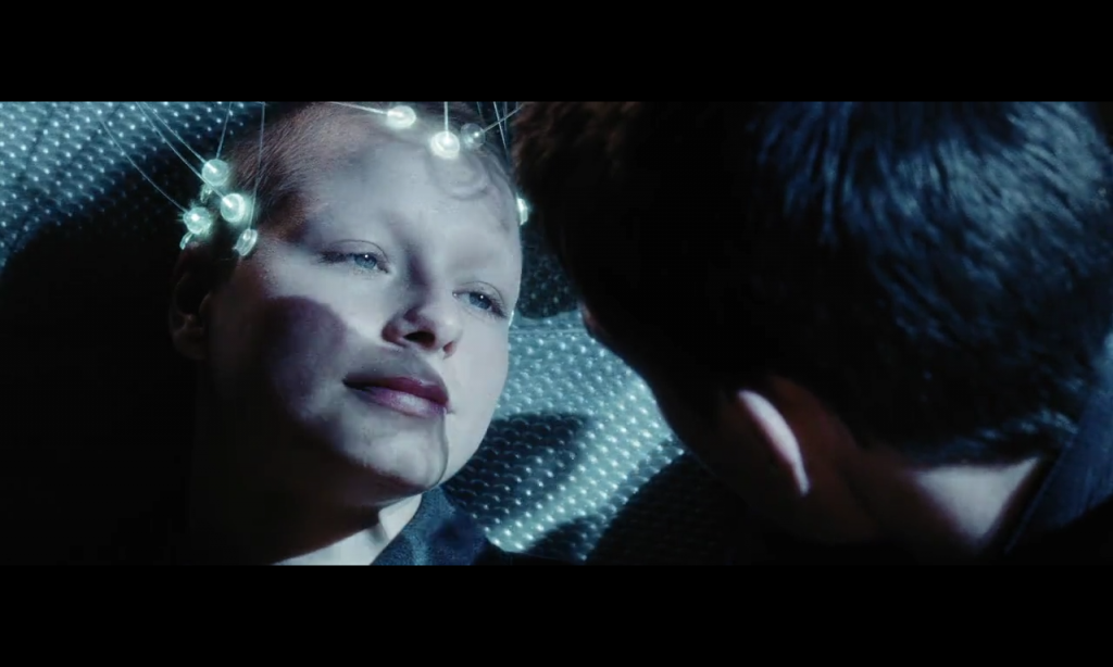
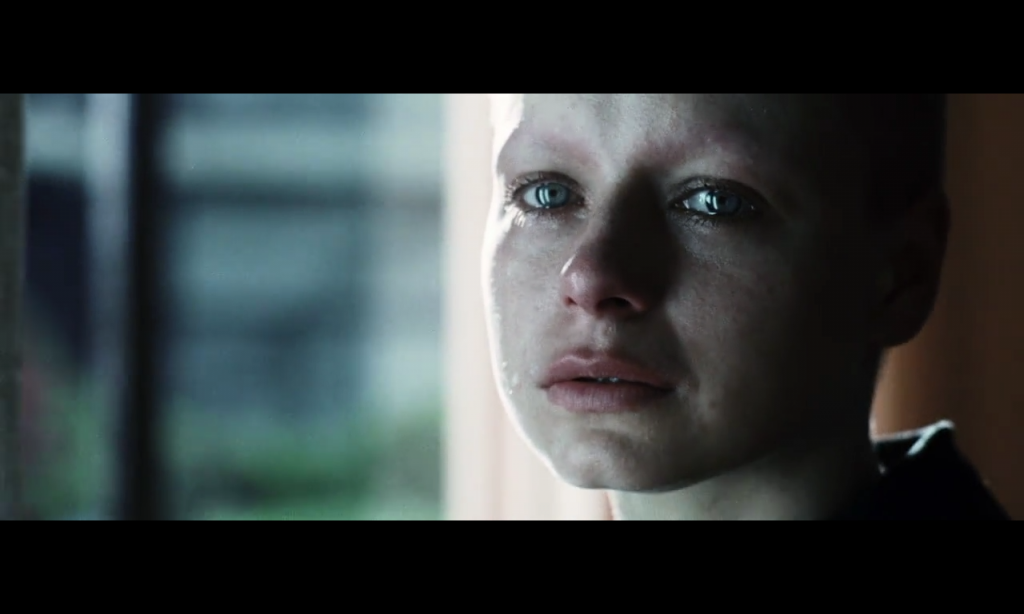
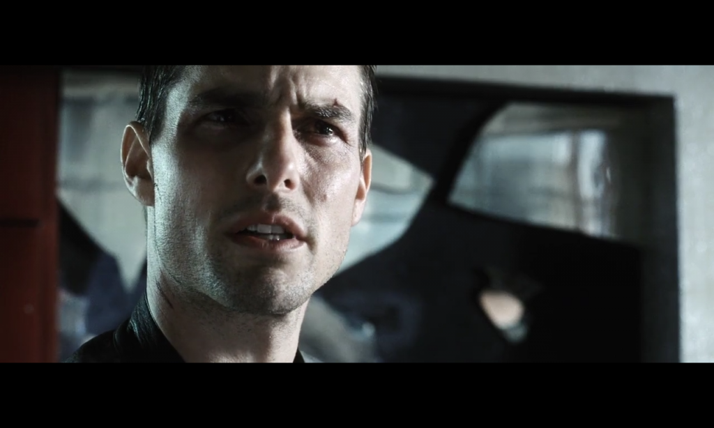
Magenta areas of the face can show a vulnerable emotional connection to the other character on screen. Often present at intense or cathartic moments: breakups, sexuality, flirtation, this is not a sign of physical pain or weakness, but an inability to overcome the emotional impact of, or receptiveness to, the other character’s identity.

MinorityReport 046

Minority Report (2002) – Color Timer Dale E. Grahn
VFX: digital color timer: PDI/Dreamworks Begonia Colomar; color timing supervisor: ILM Kenneth Smith
Super 35 mm (Kodak Vision 500T 5279, Vision 800T 5289, Eastman EXR 200T 5293, Fuji Super F-500T 8572)
parts of the film were processed with bleach bipass
Print 2.35 : 1 Technicolor 35 mm (anamorphic) (Kodak Vision Premier 2393)

MinorityReport 058


Minority Report (2002) - Color Timer Dale E. Grahn VFX: digital color timer: PDI/Dreamworks Begonia Colomar; color timing supervisor: ILM Kenneth Smith Super 35 mm (Kodak Vision 500T 5279, Vision 800T 5289, Eastman EXR 200T 5293, Fuji Super F-500T 8572) parts of the film were processed with bleach bipass Print 2.35 : 1 Technicolor 35 mm (anamorphic) (Kodak Vision Premier 2393)

Minority Report (2002)
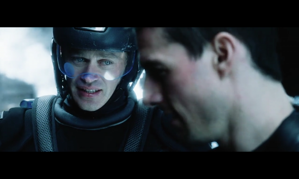
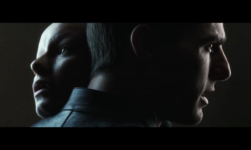
Partners face off in an unfortunate circumstance;
both must follow their assigned path despite how it might hurt the other.

MinorityReport 060

John Anderton plays opposite an adversary.
Confused, hurt, but decisive, he is not vulnerable to the emotions of the other character (pictured below).


MinorityReport 061

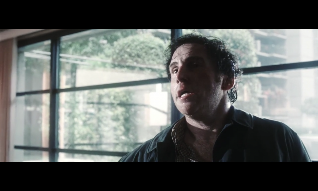
Making his confession the adversary puts his life in John’s hands.


Minority Report – high contrast

The high contrast look of Minority Report can be misleading. In this shot the blacks are actually lifted and highlights are a good bit below max. This allows for a nice smooth roll off into black and a feeling of deep deep shadows without having a crushed or crunchy clipping feel. The highlights also have a bloom that softens the hard contrast and adds a dream like layer to the experience, as if a subtler version of the pre-cognition seen by the oracles of the film. This relationship heightens the experience in its assertion that the plot is itself a premonition of our own real world future.

Minority Report (2002) - Color Timer  Dale E. Grahn digital color timer: PDI/Dreamworks Begonia Colomar; color timing supervisor: ILM Kenneth Smith   Super 35 mm (Kodak Vision 500T 5279, Vision 800T 5289, Eastman EXR 200T 5293, Fuji Super F-500T 8572) Print 2.35 : 1 Technicolor 35 mm (anamorphic) (Kodak Vision Premier 2393)

Minority Report (2002) – Color Timer Dale E. Grahn
VFX: digital color timer: PDI/Dreamworks Begonia Colomar; color timing supervisor: ILM Kenneth Smith
Super 35 mm (Kodak Vision 500T 5279, Vision 800T 5289, Eastman EXR 200T 5293, Fuji Super F-500T 8572)
parts of the film were processed with bleach bipass
Print 2.35 : 1 Technicolor 35 mm (anamorphic) (Kodak Vision Premier 2393)