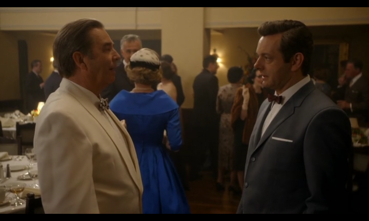
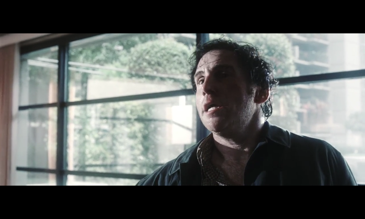
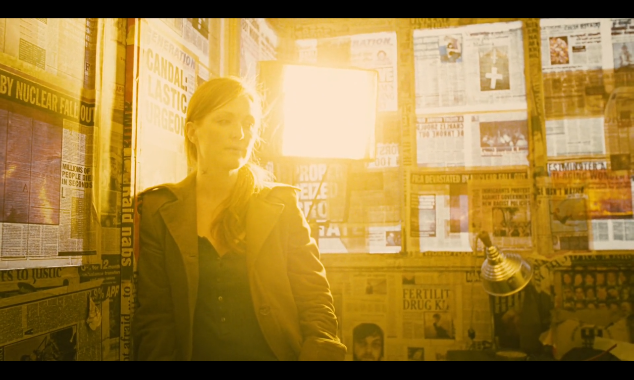
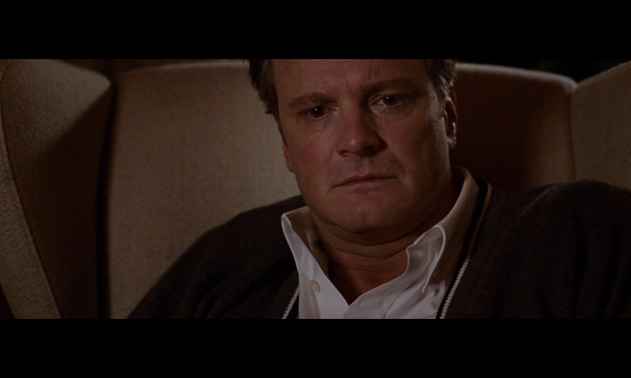
The changing color in this film works as a clear emotional subtext essential to the story. Saturation is the life blood of the character’s emotion –missing. His environment is shrouded in deep desaturated earth tones evoking stability, unchanging, firm heavy ground. This is broken as his emotions are ignited and colors spark to life. People that engage his romanticism aesthetically or are positive and interesting saturate, but cutting back to him he is still desaturated. When they touch his heart or his lust, like lava breaking through the heavy earth, he saturates — a red-out head rush of lust or beauty peeking through. At times the overwhelming deepness is contrasted by brighter more saturated flashbacks of a better time and scenes of the mother next door playing with her children running about 20 IRE brighter than his dark sad introversions.
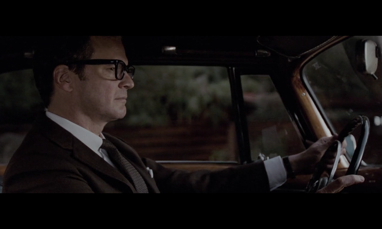
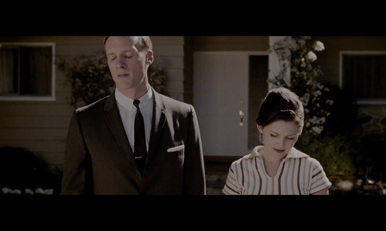
The mother and daughter bring the world to life with color until the husband comes and the colors fade away. Their young boy also seems to produce nothing but contempt in the main character George (played by Colin Firth). Over time through the saturation and desaturation it becomes clear that heterosexual men are the unyielding icon of a society that binds him and his emotions, and women, girls, and gay men are the beauty and inspiration that bring moments of joy and beauty back into his world.
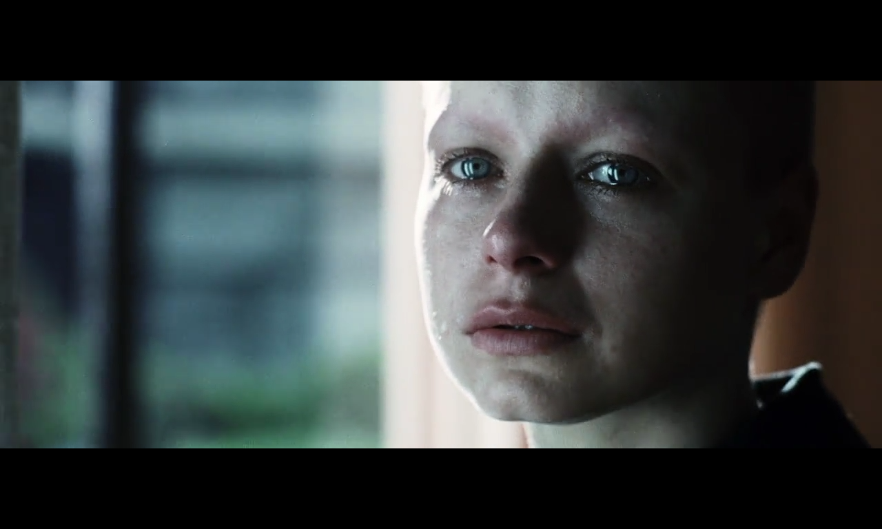
We are lead to understand the influence of color in a brief dialogue with a young man where George states that red represents rage and lust and blue spirituality. The young man he is talking to has, for that moment, brilliant blue eyes, and bright red lips.
[***SPOILERS BELOW***]
At the end, he is inspired so deeply that his entire body becomes richly saturated and his love and life come back into him, this cathartic moment gives him final breathing room to move on from his sadness and then on from the world, fading back into desaturation and final death. This affirms the subtext of saturation being synonymous with living, and shows that the characters he is taken by are the ones he perceives to be alive inside and the ones that bring him back to life. Thus the colors show he is living in a dead world of oppression and sadness, this world of the 50s heterosexual man, where he is not allowed to attend the funeral of his multi-decade lover.
[***END SPOILERS***]
Overall color characterization:
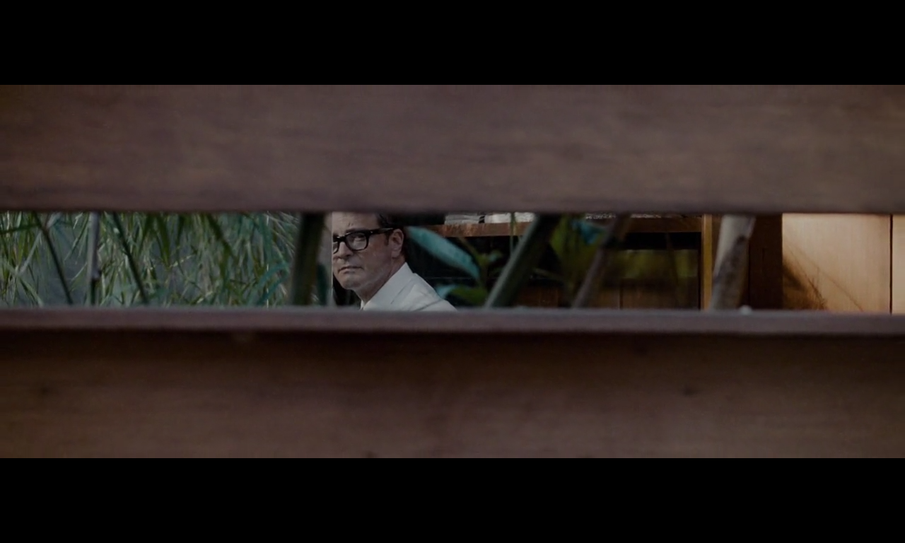
Mostly done in warm tones, all 50s style colors, lots of blue in the desaturated greens, and a lot of subtle browns and creamy soft highlights.
The blacks tended to be crushed, which gave a sense of order, clean edges, and maintained contrast in what was a fairly deep toned image. These darker tones allow the low saturation to still feel rich and thick, which I feel has a more stable serious feeling, like something unchanging, stability, or a the heavy base of a mountain. The world does not feel flighty, airy or open, it feels settled and firm. The passing moments of high saturation feel firey, not light or fleeting, but tapping into something raw beneath the surface like lava coming through cracks in the hard heavy earth.

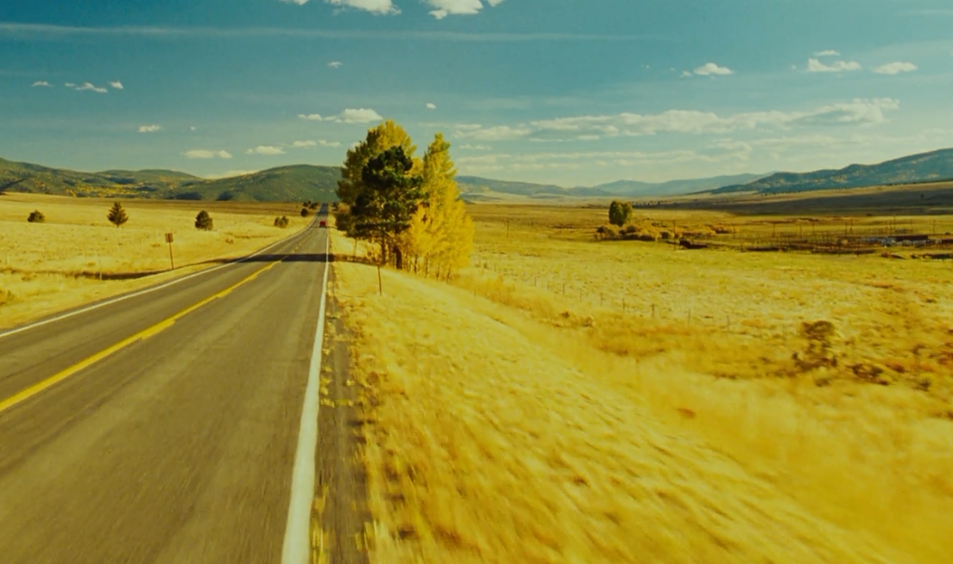
A Single Man – Stephen Nakamura digital film colorist
35 mm (Kodak Vision 500T 5279) to Digital Intermediate (2K) (master format)


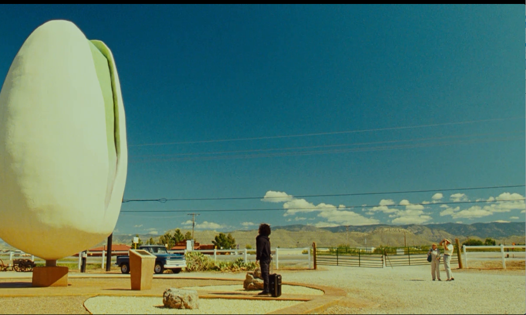
A Single Man – Stephen Nakamura digital film colorist
35 mm (Kodak Vision 500T 5279) to Digital Intermediate (2K) (master format)

A Single Man – Stephen Nakamura digital film colorist
35 mm (Kodak Vision 500T 5279) to Digital Intermediate (2K) (master format)