Tag Archive | interior

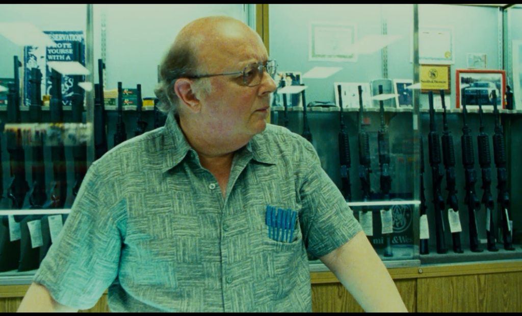
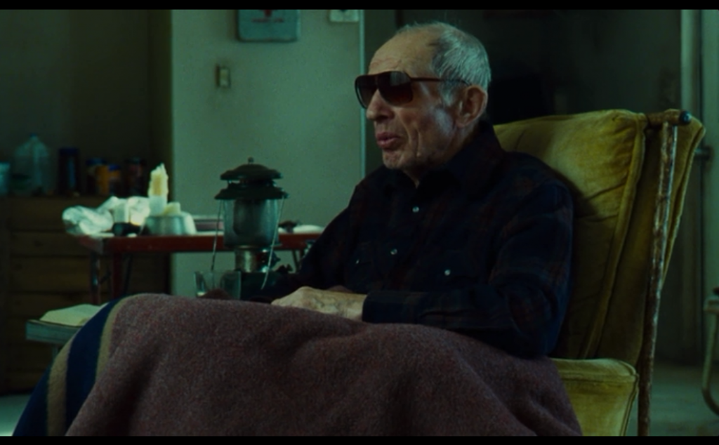
This Must Be The Place – cross processed

Cross processed slide film when balanced to appealing skin tones can send the rest of the picture to a strong vibrant green. In this case it’s used as a gritty fluorescent effect. This could also be described as an aquamarine wash with skin-tone recovery selections.

Both of these scenes have a sort of gross institutional feel, the kind of place you wouldn’t want to spend a lot of time, which says something about the motivations of the characters found there.

This Must Be The Place  -  digital intermediate colorist Andrea Orsini  35 mm (Kodak Vision3 200T 5213, Vision3 500T 5219) negative to 2K digital intermediate

This Must Be The Place – digital intermediate colorist Andrea Orsini
35 mm (Kodak Vision3 200T 5213, Vision3 500T 5219) negative to 2K digital intermediate

ThisMustBeThePlace 011

Drinking Buddies – low con high sat orange/teal

Drinking buddies is a rare color specimen. Properties normally associated with high budget block busters are applied to this low budget indie flick. As seen here, the orange/teal split is used, but on a low contrast image with saturation often leaning to the high side.
Perhaps this look mimics the production, using fairly big main stream names for a less than million dollar film and indie-standard story.

Drinking Buddies (2013)  -  Colorist Alex Bickel Red Scarlet  2.35 : 1

Drinking Buddies (2013) – Colorist Alex Bickel
Red Scarlet 2.35 : 1

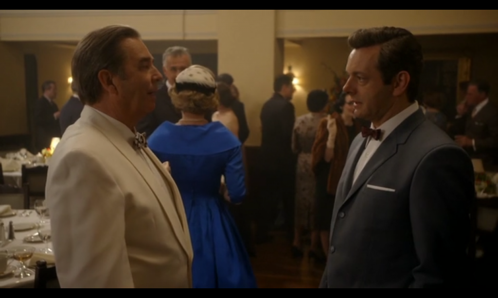
Masters Of Sex – warm with neutral punch outs

This scene is very warm, but high saturation apparel remain unaffected by the warm grade. Because of their more neutral balance and high saturation these items stand out quite a lot. It’s slightly distracting to me because they don’t quite fit in, but perhaps it indicates a rising popularity of saturated synthetic fabrics, which at the time were breaking new ground on a regular basis. According to http://www.straw.com/sig/dyehist.html in 1956 “One person working out of every 7 in the USA received his income from work performed in textile or apparel industries”

The interesting thing about this scene is that the colors that stand out are not worn by the main characters, they are not to draw attention to the dialogue but perhaps to draw it away. Most of this scene is posturing, the intermingling of people, winding down previous events and a calm before the storm to come. The dialogue itself is fairly benign.
Masters Of Sex - colorist Randy Starnes

Masters Of Sex – colorist Randy Starnes